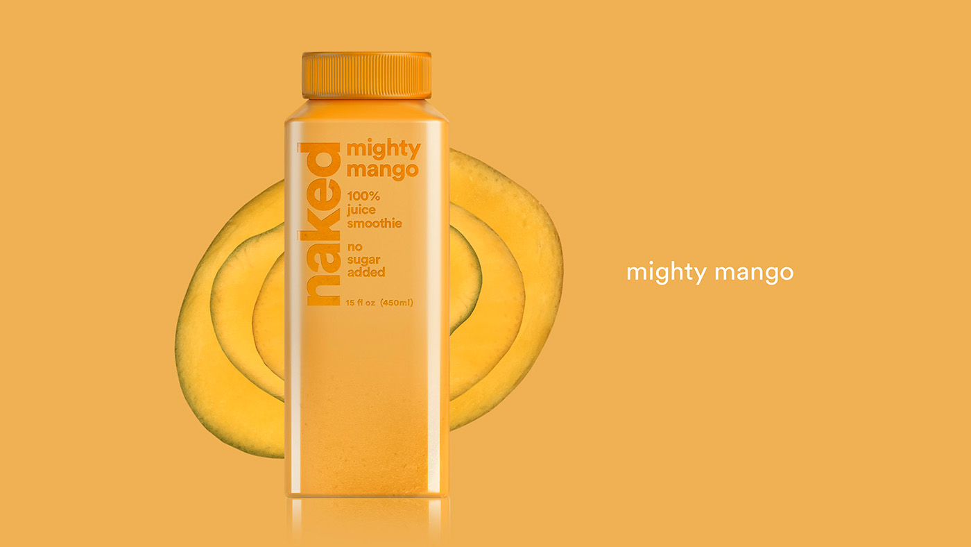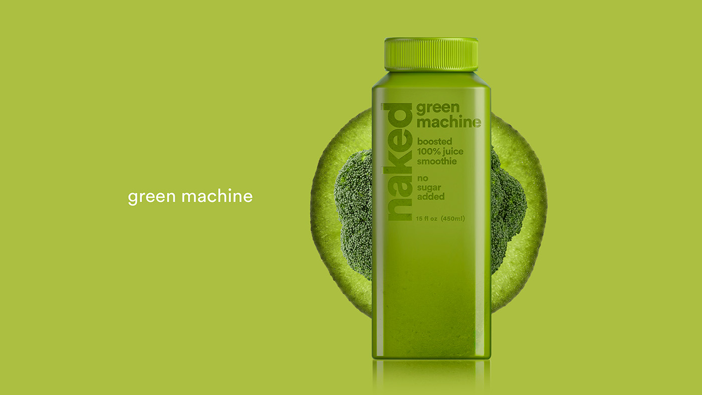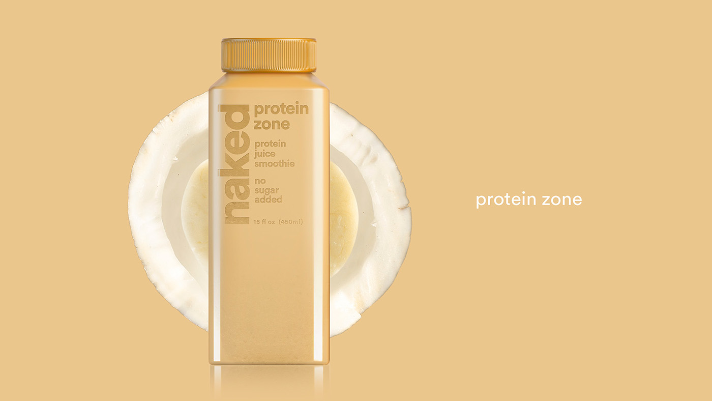
The idea behind this design was to use the letters from the logo and copy as a kind of peel, where removing them would let the juice show through inside them. I did this using a frosted label that becomes more transparent as it goes toward the bottom of the bottle. In this way, the word “Naked” has more impact.


